Other Projects


Nouraia
Nervous System Support for Modern Life
This self-initiated brand exploration was created to demonstrate my strategic approach to branding, packaging, and digital experiences for wellness-focused businesses. While not commissioned by a client, the project follows the same research, positioning, and design process I bring to commercial engagements.
Self-Initiated Brand Exploration
A strategic brand identity exploration created to demonstrate how premium wellness brands can communicate calm, credibility, and emotional connection through thoughtful branding, packaging, and digital design.
Rather than responding to a client brief, this self-initiated project explores how a premium supplement brand could differentiate itself in a crowded wellness market through strategy-led branding and a cohesive customer experience.
Luxury Wellness & Holistic Skincare
How might a luxury wellness brand communicate scientific credibility and emotional warmth without relying on the visual clichés often found in the wellness industry?
Nouraia was created as a self-initiated exploration to answer that question. The project investigates how a premium skincare and holistic wellness brand could establish trust through restrained typography, sophisticated color palettes, thoughtful packaging, and a calm digital experience.
Audience
High-performing women experiencing chronic stress, burnout, and nervous system dysregulation.
Positioning
A premium supplement brand that bridges scientific credibility with emotional depth—designed to support regulation, not just symptom relief.
Design Approach
A minimal, grounded aesthetic using editorial typography and soft, nature-inspired tones to evoke calm, trust, and refinement.
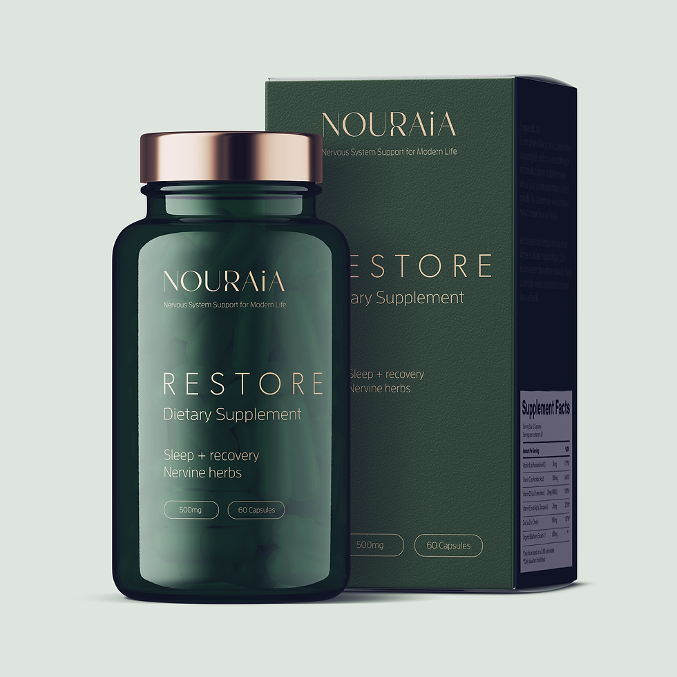
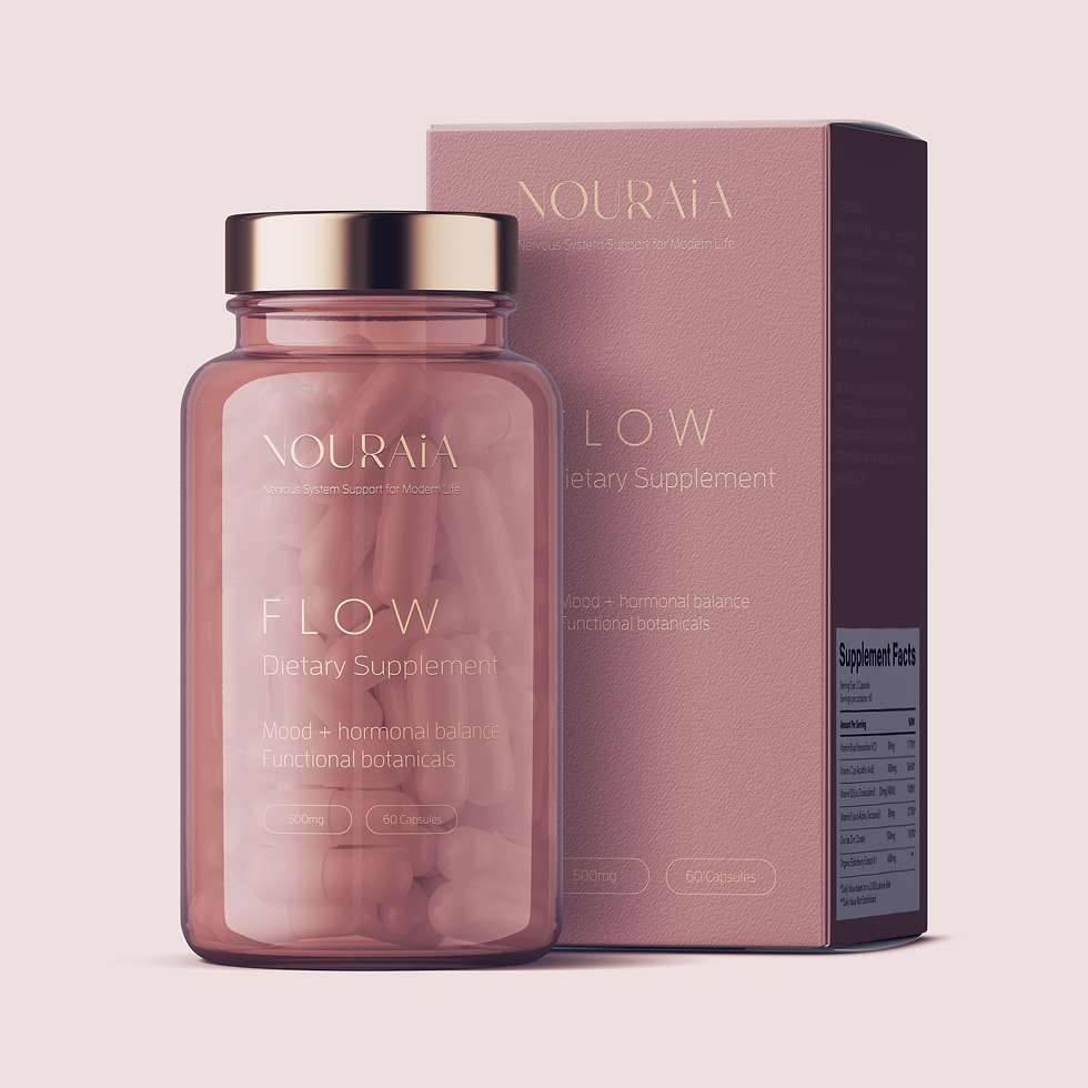
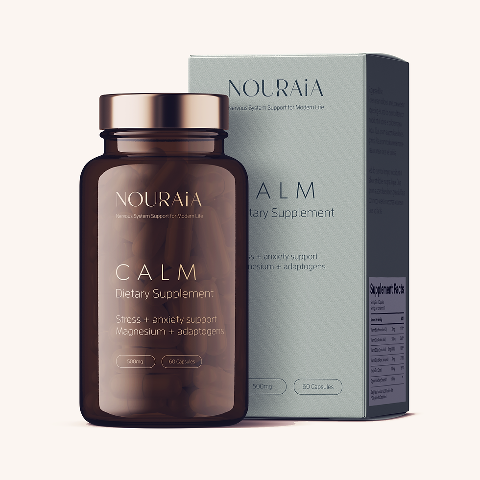
The packaging system was designed as part of the brand exploration to demonstrate how a scalable product family could maintain consistency while allowing each formulation to be easily recognized.
Core Product line:
CALM — Stress & anxiety support
RESTORE — Sleep & recovery
FLOW — Mood & hormonal balance
System Principles:
-
Distinct color variations within a cohesive palette differentiate each SKU.
-
A consistent layout reinforces brand recognition across the product line.
-
Clear typographic hierarchy guides the customer through:
-
Product name
-
Function
-
Key benefits
-
The packaging was designed to feel:-
Grounded and trustworthy
-
Visually distinct on shelf
-
Expandable for future SKUs
-
The packaging was intentionally designed to feel:
-
Grounded and trustworthy
-
Premium without appearing clinical
-
Visually distinctive on shelf
-
Flexible enough to accommodate future product expansion
-