Why Your Wellness Brand Isn’t Booking
- Eva Eriksson

- Apr 23
- 4 min read
Updated: Apr 24
“Your offer isn’t the problem. Your brand is.”
By Evoke Design Studio · Wellness & Retreat Branding

You’ve done the deep work. You’ve built a methodology, held the retreats, witnessed the transformations. You know your offer is powerful. And yet — the inquiries are inconsistent, the ideal clients are scrolling past, and something feels stuck.
Here’s the uncomfortable truth most wellness professionals don’t want to hear: the offer is rarely the problem. In most cases, the brand is doing the repelling.
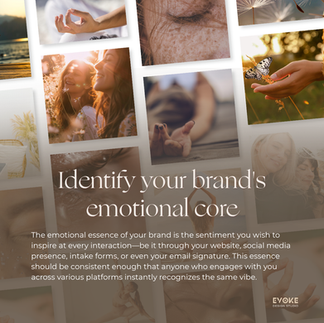
Before someone reads your bio, skims your packages, or books a call — they feel something. That feeling is your visual identity doing its job. The question is: is it doing the right job?
Here are three signs your visual identity is quietly repelling the aligned clients you’re meant to serve.
Sign 1: Your wellness brand isn't booking because the visuals look like everyone else in the wellness space
Scroll through Instagram for five minutes in the wellness niche and you’ll see the same thing repeated endlessly: muted beiges, sans-serif fonts, a stock photo of a woman meditating near a window, and a logo that could belong to any one of a hundred practitioners.
The problem isn’t minimalism. Minimalism can be exquisite. The problem is generic. When your brand looks interchangeable with dozens of others, your ideal client has no reason to choose you — and every reason to keep scrolling.
A distinctive brand does something far more valuable than looking pretty: it creates recognition. It makes someone stop mid-scroll because something feels different. That ‘different’ is not an accident — it’s the result of intentional design that reflects the specific depth, approach, and soul of your work.
Ask yourself:
If you removed your name from your website, would anyone know it was yours?
Does your visual identity communicate the specific transformation you offer, or just that you’re in the wellness space?
Could a competitor use your brand assets and it would still make sense?
If the answer to any of those is yes, your brand may be blending in when it should be standing out.
Sign 2: Your brand communicates approachable, but your pricing says premium
This is one of the most common disconnects we see, and it quietly undermines trust before the conversation even begins.
You’ve invested in a premium offer. Your retreat is an immersive, high-touch experience. Your therapy practice works with clients on some of the deepest material of their lives. But your brand — the colors, the fonts, the overall feel — signals “accommodating and affordable” rather than “worthy of serious investment.”
Humans are wired to make fast judgements based on visual cues. Before someone reads a single word on your website, they’ve already formed an impression — and that impression either aligns with your pricing or creates cognitive dissonance that makes them hesitate.
Premium clients — the ones who invest fully and show up fully — are looking for signals that confirm this is a safe, worthy investment. Polished typography, a refined color palette, intentional white space, cohesive imagery: these aren’t vanity metrics. They are trust signals.
When your visual identity doesn’t match your offer’s value, you’re asking clients to bridge a gap that most of them won’t bridge. They’ll move on to someone whose brand already communicates what they’re looking for.
Sign 3: Your brand was built for who you were, not who you’re becoming
This is the one that stings a little, because it’s often invisible from the inside.
You built your first brand when you were just starting out — when the priority was getting something up, looking professional enough, and starting to attract clients. That brand served you. But you’ve grown. Your methodology has deepened, your clientele has shifted, your prices have increased, your vision has expanded.
And your brand still looks like the version of you from three years ago.
The result is a quiet but persistent misalignment. You attract clients who were right for who you were — not who you are now. You feel a subtle cringe when you share your website. You hesitate to pitch partnerships or collaborations because something feels off. You’re doing meaningful work, but your brand is holding you to a ceiling you’ve already outgrown.
Scaling isn’t just an operational challenge. It’s a brand challenge. To attract clients at the next level, your visual identity needs to meet you there first.
So, what now?
The good news: your brand is not a permanent state. It’s a strategic tool — and when it’s aligned with the depth of your work, it does the heavy lifting so you don’t have to.
A well-built brand identity for a retreat leader or wellness practitioner doesn’t just look beautiful. It:
Communicates the depth and professionalism of your work before anyone reads a word
Builds trust with premium clients who are ready to invest at your level
Creates recognition and cohesion across every touchpoint — website, social, retreat materials
Gives you the confidence to show up, pitch, and scale
If you’re reading this and feeling the recognition of one — or all three — of these signs, that’s not a failure. It’s clarity. And clarity is the perfect place to begin.


Ready to build a brand that reflects the depth of your work?
We work with retreat leaders, therapists, and wellness founders who are ready to invest in a clear, refined, and scalable brand foundation. If that’s you, let’s talk.
Book a free clarity call at evokedesignstudio.com
Evoke Design Studio · Brand & Website Design for Wellness & Retreat Leaders

Comments